PressTigers Is All About WordPress
PressTigers is known within the WordPress community for our services covering theme design, custom coding, and print media. Our team continually updates their WP skill to ensure that we operate at the latest set of WP standards and practices.
Beyond custom solutions for our clients, our internal development team continues to develop tech-friendly and easy to use extensions including plugins and themes of our own available to download on WP's own marketplace.
We know how to bring a website to life. We understand that you're not technical. We take the time to listen to your site goals and what you need your site to achieve and efficiently translate it into technically functioning features and outputs.
OUR SERVICES
At PressTigers we've honed in on all things WordPress. We've dug deep and put together enough WordPress projects to not only excel at customizing existing WP elements but actually building anything within the realm of WP possibility from scratch.
Theme and Templates
Our designers are experienced and passionate about creating the most optimized WP templates while strictly following the WP codex.
WP Mobile Apps
We have the knowledge to design and develop complete mobile apps operating on a WP backend from the ground up. Let's talk about your app idea.
eCommerce
The WP WooCommerce plugin is one of the easiest and most cost efficient ways of running an online store. Get started with our eCommerce team today.
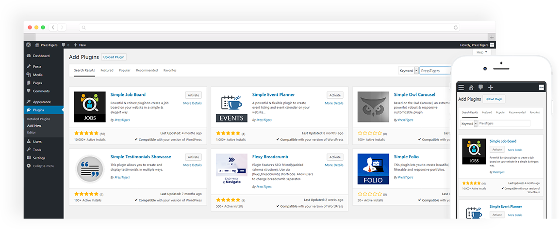
Plugin and Add-Ons
Plugins and Add-ons are what make WordPress so customizable and easy to set up. Let us help you fulfill your custom plug in needs.
Website Maintenance
Websites need to be kept up to date and running on the most recent WP version. We offer 3 monthly packages to keep your site running smoothly and securely.
PSD to WP
Have a custom coded WordPress Template? We'll code it to the highest standards and set it up on WordPress for your use.
PressTigers at a Glance
Pricing
We offer 3 primary pricing plans. Click below to learn more about Fixed Bid for short term projects, Dedicated Developers for long
term projects, and Maintenance Plans for on-going site maintenance.
Our Clients
Our clients come from a diverse set of industries and backgrounds. Check out who we've had the pleasure of working with over
the years. Don't just take our word for our WordPress prowess. Have a peek at what our clients are saying as well.


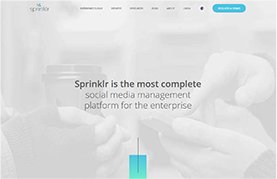
Social platform
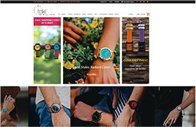
Taki Watches

BondEx
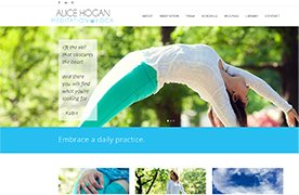
Alice Hogan
Meet the Team
The PressTigers are a killer team made up of our bi-coastal Business Office team located in New England and Southern California along
with the development team in Lahore, Pakistan.
